By now, you’ve probably heard about SlideShare being a goldmine of leads that 85% of marketers are not even using. It’s highly underutilized compared to Facebook, Twitter, Instagram and the other social giants.
In this post, I’m going to make a case for why you NEED to be using SlideShare in your B2B marketing efforts and how anyone can start on SlideShare and ace it.
In 2009, I started out with zero following on SlideShare and after posting up my first SlideShare presentation, I got a flurry of leads and subsequently got even more after my next one.
Fast-forward to today and I now have around 1M views on my personal profile with an additional 2M on my agency channel – HighSpark.
After speaking with other power-users including Conrad Wadowski at Teachable who made $6000 from one presentation on Growth Hacking to Jake Wengroff at JBX1 marketing who earned $300,000 in revenue which with Frost and Sullivan directly attributable to leads coming from SlideShare – we can really see the awesome power of a great presentation.
In this post, I’ll talk about how to add SlideShare at the top of your sales funnel and get real email leads and conversions with your first presentation.
1. Just Start Collecting Leads
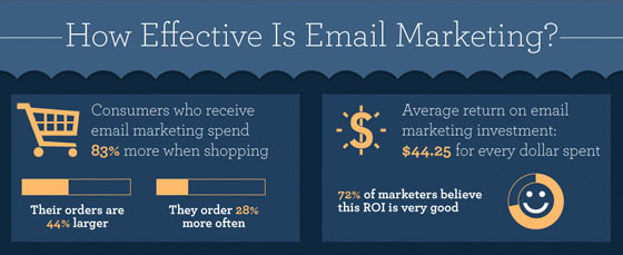
If you’re not already collecting email leads for your business, you need to get started immediately. Email is simply the most effective revenue conversion vehicle for your business.
Here are the stats from Unbounce:
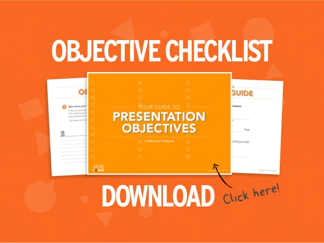
We did this with our presentation on Seth Godin’s Really Bad PowerPoint, which got us featured on Hubspot and continues to bring us 400 leads every month even though we published it 2 years ago!
If your presentation has provided enough value and they see you as the expert on the topic they will be hungry for more.
So give them something they can sink their teeth into – whether that’s a webinar, video or email series, swipe file or anything else that relates to your product or service and offers a possible up-sell opportunity.
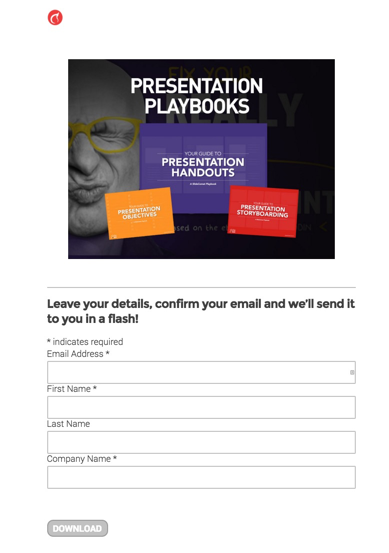
Throwing up a landing page and attaching your lead magnet only takes minutes with software like PageWiz. Before you know it, you’re on your way to collecting leads from SlideShare – don’t make it super complicated just get it done.
Pro-Tip: You can’t start adding outbound links until after the 3rd slide but on that fourth slide make sure you do because each after slide less and less people will see.
2. Invest in Graphics Worth Sharing
Most people make the mistake of not investing in their presentations.
The simple fact is there is 400,000 presentations uploaded every month on SlideShare and to stand out you need to start what little time you have to focus on the things that are going to give you the most results.
Purchase Affordable Graphics
By purchasing professional graphics made by top-notch designers affordably from places like Creative Market, you get to build quality SlideShares fast without a hole in your wallet.
This is how we get 80% of our presentations ranked on the first page of SlideShare and had one of the ones we did for a client, named one of the top presentations of 2015.
To get these gorgeous images, we shelled out only $29 for these ‘Comic Book Elements’ from Creative Market. Imagine that, 399,082 views for $29 (plus our time) – you do the math.
This small investment can add a whole new dimension of design to your SlideShares with very minimal effort, so consider this for your next SlideShare.
Scour the web for High Quality Free Photography – Pexels
Check out sites like Pexels.com that aggregate totally free and high-quality images from different reliable sources like Gratisography, Unsplash, and the like.
All images are under the Creative Commons Zero License, which are free for both personal and commercial use and requires no attribution. This means you can use these images for virtually anything, without any consequence. In this case, using it for SlideShares ain’t such a big stretch.
If you’re not willing to shell out the cash to use paid repositories like Shutterstock or Getty Images, these are the next best thing.
I recommend you pick images that have plenty of whitespace so it’s a no-brainer where you should put your text.
Instead of scouring for the images you need from the varied smaller free stock websites, everything has been compiled and is easily searchable in one place.
The only drawback is that you’ll need to be creative with the context of your images, because you might not always find exactly what you’re looking for. (i.e. if you wanted a guy riding a horse holding a camera)
Another feature to note is the ability to download different sized images. To make your life easier, I recommend downloading images larger than 1024 x 768 for 4:3 or 1280 x 720 for 16:9 presentations. This way, you can be assured that your SlideShare images are always high quality and full-bleed.
Free Graphics – Freepik
Freepik is another great alternative to grab FREE vectors, logos, stock photos, illustrations, PSD, and icons that you can use to increase visual appeal and maximize conversions for your presentations.
You get to pick from diverse themes that range from Fashion, Sports, Weather, Food, Music, Movies, Multimedia, Medical, and People; to name a few – whatever suits your SlideShare presentations.
There are premium ones that you can choose from wherein you can score images for a reasonable price tag.
3. Be Strategic with Link Placement
If you’re shooting for a conversion, this usually happens on your site, an asset that you can control. But putting a link to your site on every slide isn’t going to work.
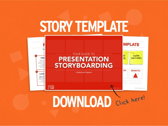
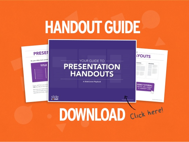
The best way to do this is to link certain slides back to relevant content on your site, that way it incentivizes your viewer to enter your owned media.
Here’s an example:
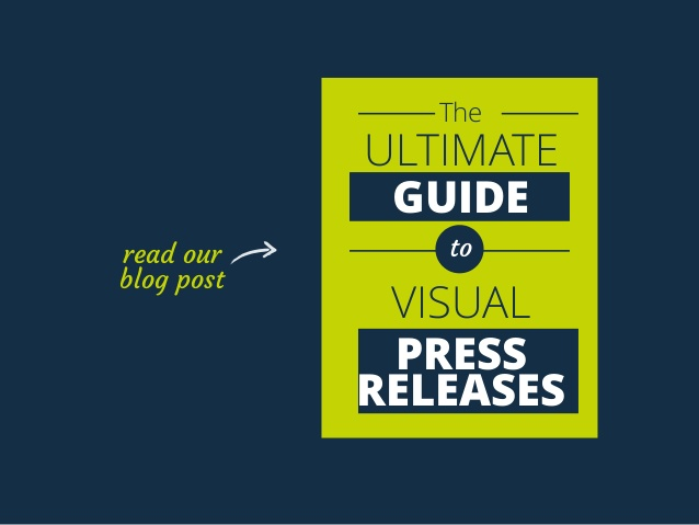
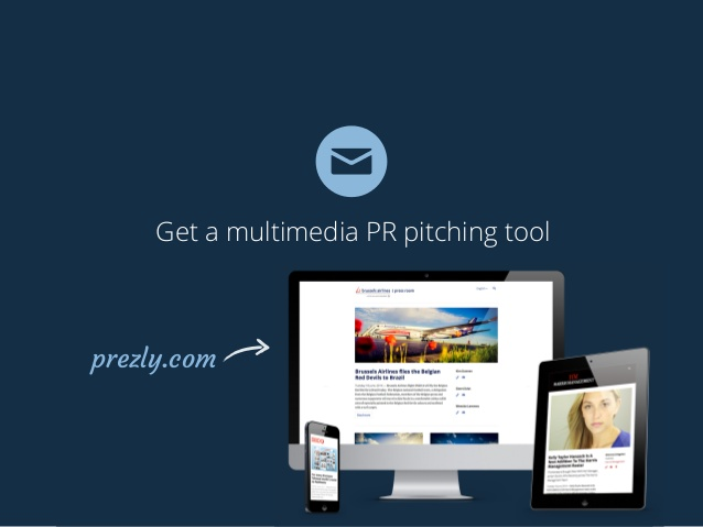
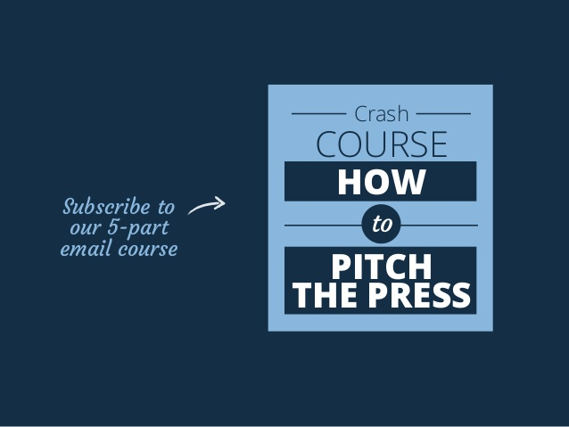
Instead of going ‘Buy my product’ all of a sudden all over your deck (this usually goes at the end). Feed your audience with resources like blog posts, email courses etc. as you tell a visual story in your SlideShare.
By having 3 different lead magnets (yet all linked to the same page) in our Really Bad PowerPoint deck, we were able to capture viewers of different interests throughout our SlideShare resulting in more opt-ins overall.
4. Optimize for SEO
People think that Search Engine Optimization is this black box that you need to hire a professional to break into. This couldn’t be further from the truth.
Anyone can do it and I’ll show you the basics in a moment. But first, let’s talk about why SlideShare is so powerful for SEO.
There are more or less two parts to SEO: Page Authority & Domain Authority.
Page Authority
Page authority is basically how popular that specific page is and is heavily dependent on the number of quality links pointing back to your SlideShare presentation.
Basically, this is a score between 1 and 100 as developed by Moz, which predicts the behavior of a specific page as to how it will rank on search engine pages. The results are a composite of many factors that affect how your presentations’ rankings behave.
SlideShare in itself is a high authority site. Creating high-quality content with curated content from highly reputed speakers or game changers in your industry is sure to build authority and amplify the PageRank of your presentations.
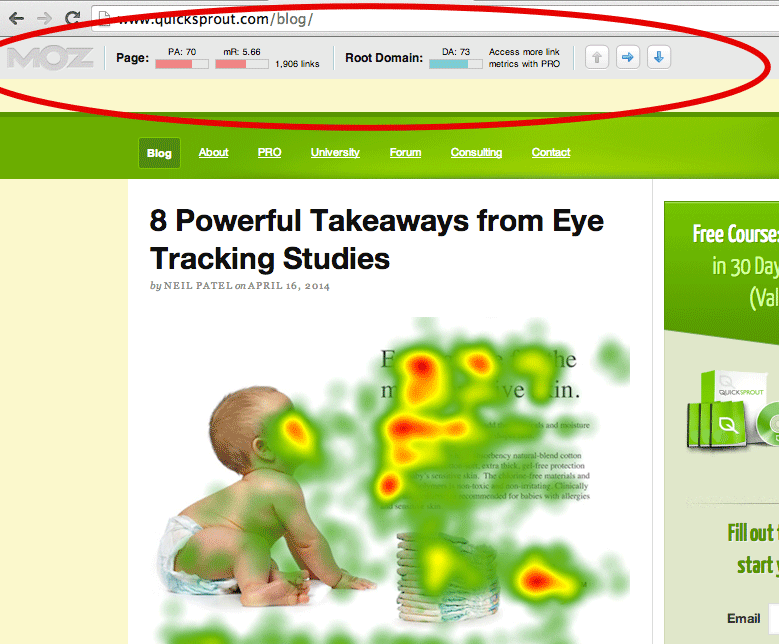
Here is Page Authority and Domain Authority MozBar results example from Digital Guide:
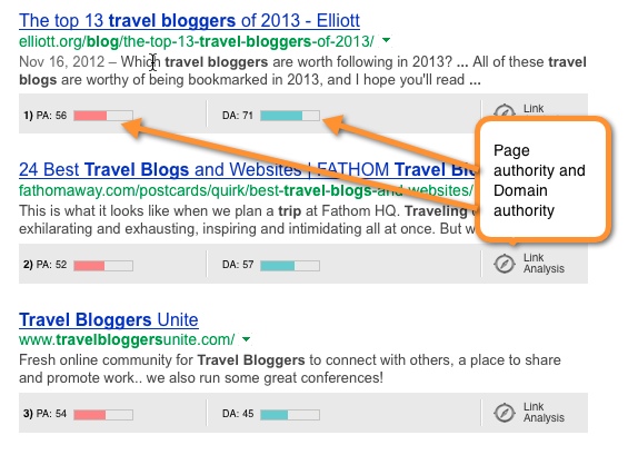
Also, this one from Quick Sprout:
Because SlideShare presentations encourage sharing and get a ton of shares and embeds – you can count on a healthy dose of links pointing back to your presentation, which in turn means better Page Authority and rankings.
Domain Authority
Domain authority on the other hand references of the domain that is hosting your presentation – namely SlideShare.net – a website that gets 70M views per month.
This is the most comprehensive comparative metric to determine how your domain ranks in comparison to other competition sites. The results fluctuate but are mostly on a progressive state.
Site ranking for Domain Authority is dubbed to be site-dependent, which means you need to focus on on-page SEO and optimization to step up your page ranks. Thankfully SlideShare largely takes care of that.
Needless to say – the domain authority of SlideShare.net is off the charts at 95.

This is probably WAY higher than your personal blog and as a result, presentations you make on SlideShare have a MUCH better chance of ranking high in the Google search results in comparison.
Putting it all Together
So what we have is a very viral medium (presentations) paired with a strong domain, which is a recipe to rank high on Google SERP.
Here’s a story on how Dave over at Driftt.com got 28,000 views and ranked his presentation “What is Product Marketing” on the first page of Google within 30 days of posting it.
If you want to learn how to research keywords – checkout this handy guide from Quick Sprout.
Pro-Tip: Don’t do keyword research until AFTER you have chosen a topic to write about. The concept for your presentation is MORE important than keyword hunting.
5. Offer Alternative Ways of Conversion
We all hear about the power of collecting emails but sometimes we forget that there are multiple ways to get a positive interaction with the reader.
Include a “PayWithATweet” so people can spread the love and get the presentation in return:
Or if you just want to direct audiences to a standalone lead page using both big buttons and discrete links:
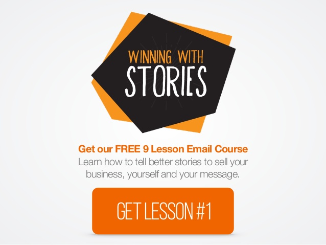
The point is that each call to action will appeal to a different person and you can capitalize on that by given each of them the choice.
Here’s how you create a quick “PayWithATweet” campaign:
Head over to PayWithATweet.com
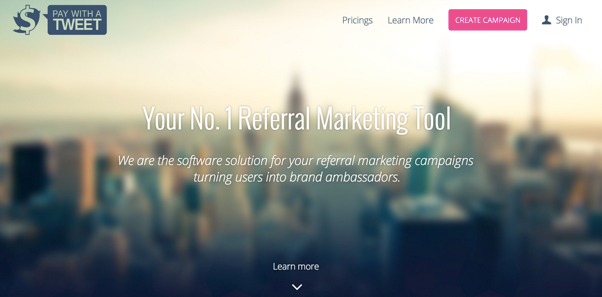
Create a new campaign and enter the details:
Copy the link and insert it into your presentation
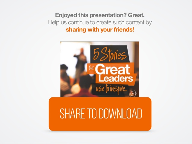
That’s all there is to it – now you have a viral presentation waiting to be published.
6. Mention Influencers
Using tools like ContentMarketer.io, you can start your own outreach strategy to influencers in your industry.
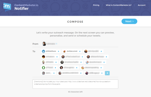
If you don’t have a huge audience to begin with, it makes sense to try piggybacking on someone else’s audience.
ContentMarketer.io connects you to top influencers by exporting Twitter handles, email addresses, and other contact details from the names of the people mentioned in your SlideShare presentations in a couple of clicks.
Initially – it’s not what you know but WHO you know that will help you get that leverage on your SlideShare presentations. The strategy here is to make it known that you’ve mentioned them in your SlideShare in hopes they’ll ‘scratch your back’ as well.
With their massive followings, even a small shout out back to you will result in impressive traffic for your SlideShare.
In our case, we reached out to high-stakes presentation consultant, Cliff Atkinson to collaborate. We repurposed an existing blog post of his with permission to create this deck:
The result was better than we expected. It got featured as SlideShare of the day, garnering 50,000 views and 900 social shares. A win-win for both. We got quality content to upload while he got more reach for his work.
Conclusion
So that’s how I went from 0 to 2,000,000 views on SlideShare. As you can see, it’s not rocket science, but really consistent and targeted efforts to achieve our objectives.
Now that you have the tools, how will you use SlideShare? Leave a comment below and let us know.
About the Author: Eugene Cheng is the co-founder and creative lead of HighSpark (formerly Slide Comet, a strategic presentation consultancy serving Fortune 500 companies like: Panasonic, Dentsu, Nike. A self-confessed presentation obsessive, he relishes in building compelling visual content for his agency’s channel and his personal channel on SlideShare and is also a Keynote Author (top 1% of SlideShare). We made a template based off our SlideShare that got 20,000 views and 300 social shares within a week for you to swipe for FREE!

